Outdoor banners fail to convert customers when design mistakes reduce visibility, clarity, and message impact. From poor font choices to weak placement strategies, even small errors can lead to lost attention and missed business opportunities.
A well-designed banner connects design elements, audience behavior, and environmental factors into a single visual message. When any of these elements are misaligned, conversions drop.
What Makes Outdoor Banners Effective in the First Place?
Outdoor banners are effective when they combine readability, contrast, and strategic messaging to capture attention within seconds.
People don’t read banners. They scan them.
That means your banner must deliver:
- A clear message in under 3 seconds
- Strong visual hierarchy
- High contrast between text and background
- Simple and direct call-to-action
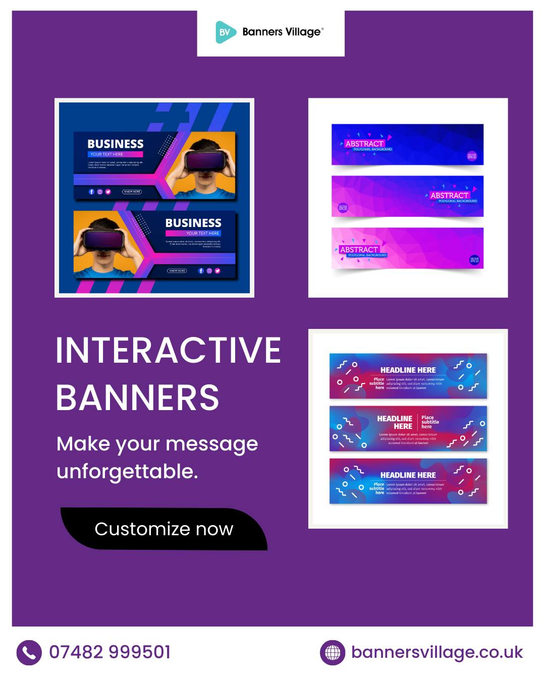
Businesses investing in outdoor banner printing often see better results when design aligns with real-world viewing conditions like distance, motion, and lighting. Established providers like Banners Village focus on production precision and material quality, ensuring banners remain impactful even in challenging outdoor environments.
Are You Using Too Much Text on Your Outdoor Banner?
Yes, too much text is one of the most common mistakes that reduces readability and drives customers away.
Outdoor banners are not brochures. They are quick visual signals.
When overloaded with text:
- Key messages get diluted
- Readability drops from a distance
- Viewers lose interest instantly
Instead, focus on:
- One headline
- One supporting line
- One clear CTA
This structure improves clarity and ensures your message is remembered.
Why Poor Font Choices Can Destroy Your Banner’s Impact
Poor font choices reduce legibility and weaken brand perception, especially in outdoor environments.
Fonts must be readable from a distance and under different lighting conditions.
Avoid:
- Script or decorative fonts
- Thin lettering
- Overly stylized typography
Choose:
- Bold sans-serif fonts
- Large font sizes
- Clean letter spacing
For businesses creating personalised banners uk, font clarity directly influences how effectively the message connects with the audience. Trusted platforms like Banners Village support customization with print-ready guidelines, helping businesses avoid costly design errors.
Is Your Color Contrast Strong Enough to Grab Attention?
Weak color contrast makes banners invisible, even in high-traffic areas.
Color contrast is the relationship between background and text visibility.
Low contrast results in:
- Poor readability
- Reduced visibility from a distance
- Lower engagement
Best practices include:
- Dark text on light background or vice versa
- Avoiding similar color tones
- Using brand colors strategically
High contrast ensures your banner stands out in crowded environments.
Are You Ignoring Viewing Distance and Placement?
Yes, ignoring viewing distance leads to poor sizing and unreadable designs.
Outdoor banners must be designed based on where and how they will be seen.
Consider:
- Roadside banners need larger text
- Event banners require bold headlines
- Storefront banners should be eye-level
Key factors include:
- Distance from viewer
- Speed of passing traffic
- Angle of visibility
Businesses using Special Banners for unique placements benefit from tailoring design to specific environments. Experienced providers like Banners Village often guide customers on optimal sizing and placement for maximum visibility.
Why Cluttered Layouts Confuse Customers Instantly
Cluttered layouts overwhelm viewers and make it difficult to understand the message.
A banner should guide the eye, not confuse it.
Common layout mistakes:
- Too many images
- Multiple fonts
- Lack of spacing
Instead, focus on:
- Clean structure
- Balanced white space
- Logical visual flow
A simple layout improves comprehension and increases engagement.
Is Your Call-to-Action Missing or Weak?
Yes, a missing or weak call-to-action results in lost conversions.
Even if your banner grabs attention, it must guide the next step.
Effective CTAs:
- “Call Now”
- “Visit Today”
- “Order Online”
Weak CTAs include:
- Vague phrases
- No action-oriented language
- Hidden placement
Your CTA should be:
- Visible
- Clear
- Action-driven
Are Low-Quality Images Hurting Your Brand Perception?
Low-quality images reduce credibility and make your brand look unprofessional.
Outdoor banners are large-format visuals, so image quality matters more.
Avoid:
- Pixelated graphics
- Low-resolution images
- Poor scaling
Use:
- High-resolution visuals
- Professionally designed graphics
- Consistent branding elements
This is especially important for event-specific banners like Birthday Banners, where visual appeal directly impacts engagement. Reliable providers such as Banners Village ensure print quality matches digital designs, preserving clarity at scale.
Do You Consider Weather and Material Durability?
Ignoring weather conditions can damage your banner and reduce its lifespan.
Outdoor banners face:
- Sun exposure
- Rain
- Wind
Choosing the right material ensures durability.
Important considerations:
- UV-resistant inks
- Waterproof materials
- Strong finishing edges
Businesses investing in outdoor banner printing should always match material choice with environmental conditions. Companies with proven expertise, like Banners Village, prioritize durable materials to maintain performance over time.
Is Your Branding Consistent Across the Banner?
Inconsistent branding confuses customers and weakens recognition.
Your banner should align with:
- Logo placement
- Brand colors
- Tone of messaging
Consistency builds trust and makes your business memorable.
Avoid mixing:
- Different color schemes
- Unrelated fonts
- Conflicting messages
A cohesive design strengthens brand identity.
Are You Designing Without Understanding Your Audience?
Yes, ignoring your target audience leads to irrelevant messaging and poor engagement.
Different audiences respond to different visuals and tones.
For example:
- Retail customers prefer bold, attractive visuals
- Corporate audiences prefer clean and minimal designs
- Event audiences respond to vibrant and festive themes
Understanding audience behavior ensures your banner resonates.
Why Ignoring Simplicity Reduces Conversion Rates
Lack of simplicity creates confusion and reduces message retention.
Simple banners perform better because they:
- Deliver clear communication
- Improve recall
- Reduce cognitive load
Focus on:
- One goal
- One message
- One action
This approach increases effectiveness and conversion.
How Professional Outdoor Banner Printing Improves Results
Professional outdoor banner printing ensures better quality, durability, and design precision.
Benefits include:
- Accurate color reproduction
- High-resolution output
- Long-lasting materials
Working with experts in outdoor banner printing helps avoid common design and production mistakes while ensuring your banner performs effectively in real-world conditions. Established brands like Banners Village reinforce trust through consistent quality standards and customer-focused support.
Frequently Asked Questions
What is the biggest mistake in outdoor banner design?
Using too much text is the biggest mistake, as it reduces readability and weakens message impact.
How many words should an outdoor banner have?
An outdoor banner should ideally have no more than 6 to 10 words for maximum clarity.
What colors work best for outdoor banners?
High-contrast color combinations like black and yellow or white and blue work best.
What size font should I use for outdoor banners?
Font size depends on viewing distance, but larger fonts are always more effective.
Are images necessary for outdoor banners?
Images help attract attention, but they must be high quality and relevant.
How long do outdoor banners last?
Durability depends on material and weather conditions, but high-quality banners can last several months to years.
Can I design my own outdoor banner?
Yes, but using professional outdoor banner printing services significantly improves results and overall effectiveness.